Sunday, 25 November 2012

How To Make Pancakes


Open publication - Free publishing - More how

Having used Issuu twice now I've been wanting to make my own account and upload some books of my own. I decided to revisit this work from a brief I did in my foundation year just over a year ago and make it into an issuu publication. The brief was a 'How To' brief and we were given the choice of it being whatever we wanted and so I went for how to make pancakes. Regardless, here it is all new and shiny with a few changes as to the first book I made :)


Here's the original, you can also find the individual pages on my deviantART here
Just keep clicking the previous button to view them all.

Thanks for reading :)

Tuesday, 20 November 2012

some thumbnails for the new project

Penguin.

Pygmy Marmoset


This is on my deviantART but I thought I'd put it here too :)
Just a colour pencil drawing of what I think is a pygmy marmoset. Just from a photo I took when I went to Edinburgh Zoo last February.


Monday, 19 November 2012

Tape recorders and things


Infographical!

The fire extinguisher in my halls. 

Instructions for telephoning from Information Graphics: Innovative Solutions in Contemporary Design by Peter Wildbur and Michael Burke.

Wednesday, 14 November 2012

"This is recorded on sticky tape and rust"

More research!
Fascinating. 
These guys obviously weren't that prepared for being filmed though.

New brief - How does a tape recorder work?

INFOGRAPHICS

Just quickly googled our question and this guy seems to know his stuff. More research is needed though. 

Just to check.

But it does sound convincing...

http://answers.yahoo.com/question/index?qid=20080717055152AACpi2V

"When someone talks into a microphone the movement of the diaphragm caused by the sound creates patterns of tiny electrical pulses. (These are wave patterns, such as you often see in audio software. There are hundreds of pulses a second)

Likewise the same pattern of electrical pulses put through a loudspeaker causes the diaphragm to vibrate and make the identical sound that was spoken into the microphone.

A tape recorder takes the electrical pulses from the microphone and runs them through an electromagnet that is touching the continuously moving tape. The tape contains magnetic material that alters its position depending on the strength of the magnetic field. 

When the microphone creates a strong electrical pulse then the magnet will become stronger and create a different mark on the tape to a weaker one.

Conversely, when reading a tape, the movement of the differing marks on the tape past the reading head of the tape recorder creates electrical pulses that match those which were originally created by the microphone. When these pulses are put through a loud speaker you get the original sound that was spoken.

In the real world a tape recorder has to increase the level of the electrical pulses from the microphone (e.g. amplify them) in order to make them strong enough to affect the tape, and it does the same when reading the tape so that the loud speaker actually makes a loud enough sound."

Thursday, 8 November 2012

Final posters for 'Regret'

Poster #1 male character version
Poster #2 female character version.
Poster #3 double poster.

Regret Poster #2 development

 Ink drawing of the female character.
I decided that I'd create a second poster for a like release 'campaign' series of posters. So I've just mirrored the design of the poster of the male character and used the drawing from above. I thought she could do with some red lipstick and then I realised I forgot to move the lighting. After this I thought they looked a bit too bright so I lowered the opacity even more to mute it. Hopefully this helps with the design and composition, drawing the eye from the title, to the lips and then to the sub heading 'love is deadly'.

Poster for 'REGRET'


I'm going to make another poster too with the female character but mirrored to this one and then put them both together.

Poster development


Changed the opacity of the red to mute it a little. 
Ink drawing of the male character.

 I decided to add more to the poster because I felt it looked a little empty. The release year, the tagline and the actors names at the top. I tried to line the actor names up with the 'A Film by Amy Cusimano and Edwin Burrow' vertically and also horizontally with the top bit of the stem of the 'T' and the bottom of the first 'R'.

Wednesday, 7 November 2012

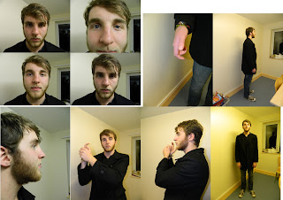
Photos to work from

Still from the film. 
 Photos of the female character.
 Photos of the male character.
More photos of the male character.
New photo with the pose from the film still.

Film poster collection moodboard

Just a collection of some film posters I've looked at. Some old film noir posters, some neo noir posters and then some more recent films I just like the appearance of. I've looked at Drew Struzan's work as I've shown with videos that I've posted below. I quite like the poster art he create, to do it myself would take too long for this brief but regardless I want to create something a bit more illustrative from photos that I've taken. I thought of the burn after reading poster too because it was a poster that used to be up on the wall in my media studies classroom in sixth form. I found it more interesting than the other ones around it at the time. The silhouette style has sort of implanted itself into my head from then. I like the idea of monochromatic images like Scarface, The Godfather and Chinatown too. The Batman Dark Knight Rises posters are something I might try and use for my poster design, creating 2 posters featuring one character and the other (male and female characters). Mainly incorporating the idea of character posters as a sort of advertising campaign, similar to what was done with The Dark Knight Rises recently.

Sunday, 4 November 2012

I noticed this today

I watched Scarface today, good film but that's not what this post is about.
When I began to watch it I noticed the Universal logo is a sans-serif font on top of a serif font. The sans-serif font could well be helvetica extended too.

Friday, 2 November 2012

The Affair - film noir

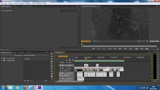
Screen grabs from the editing

 Editing using Adobe Premiere Pro, I learnt how to use the photoshop for video editing but I felt more comfortable using premiere pro as I've used it before.


 I edited the track 'The Two Of Us' by Mark Isham from 'The Black Dahlia' soundtrack on a audio editing program called Audacity. I used fades to make the music start and end more smoothly. The rough 30 seconds we used was taken from a section in the track, not directly from the start.

We also recorded the narration using Audacity.